Your Instagram highlight covers may not seem like an important part of your overall Instagram feed. However, if you’re sharing important or valuable information in your highlights, your covers play a major role in whether they actually get seen. Not to mention, they add to your overall brand aesthetic.
Ultimately, your Instagram highlights in general present a valuable opportunity. As Benjamin Chacon, Content Marketing Strategist at Later explains:
“Instagram Stories Highlights are extremely valuable because they allow brands to easily curate and showcase the content they want users to see first. You can think of them as a movie trailer for your Instagram feed. They’re a creative way to express yourself, show off your products, drive traffic, or market your business!”
Don’t degrade the value you’re offering in your highlights by choosing covers that aren’t aligned with your brand or are messy and hard to read. Instead, use these tips to design Instagram highlight covers that drive followers to this area of your profile and give them a reason to click.
More Instagram Articles
How to Use Instagram Presets to Develop an Authentic Brand Aesthetic
5 Instagram Profile Template Ideas (Plus Examples)
Instagram Marketing for the Spiritual Entrepreneur: How to Connect and Sell
Focus on Adding Value
A highlight is meant to curate a series of ideas of messages. Since you can have many, it’s important that each highlight and its cover has a purpose—does it take away from your feed with off-brand colors and hard-to-read text, or does it add to the experience followers are having?
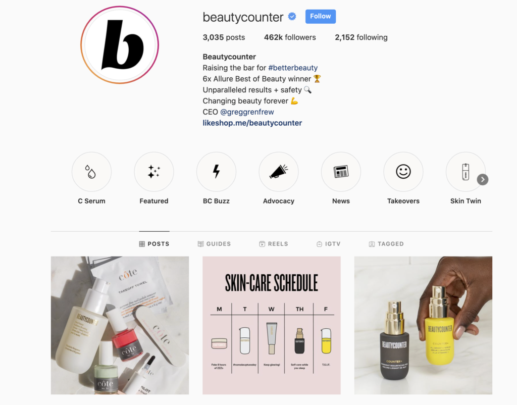
Beautycounter gives us the perfect example of this. Each icon is clear and simple, fits with their brand’s overall aesthetic and clearly has a direction and focus. Followers know exactly what they’re getting and will walk away with added value from the brand.
Audit your Instagram highlight covers: Consider whether your current highlights are necessary. For the ones that are, determine whether the overall look and feel is adding value to your profile or taking away from it. In many cases, it’s important to prune your highlights and simply update the covers of the ones that have purpose and value.
Be Clear
Icons are a great way to avoid text and make it clear what your highlight is all about. You won’t have to worry about choosing fonts and packing in words to describe your stories, which are often hard, if not impossible, to read.
To be clear with your highlight covers, consider using icons and then describe the highlight itself in one or two words underneath. Even without clicking, your community should know what type of content will be featured in the highlight.
Look at the highlights curated by the New York Yankees to see what it’s like to follow a clear pattern with your content. Each highlight has the face of one of the players with their name (or nickname) listed below it.
If you like Aaron Judge, you can click on his highlight to watch behind-the-scenes moments during practice and in the locker room. This creates a fun experience for fans who want to get to know their favorite players and fits with their overall aesthetic without being complicated.
Note that The Yankees don’t use highlights that have been designed in Canva or Photoshop, which is a great reminder that you can use images rather than graphics. This may even make your highlights stand out among the graphic-based highlights typically used.

Audit your Instagram highlight covers: How clear are your highlight covers? Is the design consistent with what’s inside or is it unclear what followers are clicking on? Consider how you can choose designs that are clear to everyone who scrolls your profile.
Keep it Simple
Don’t try to pack too much information into your icon. One image or a few words should clearly communicate what content is featured in each highlight. If using text in the highlight image itself, the key is to boil your message down into one or two words.
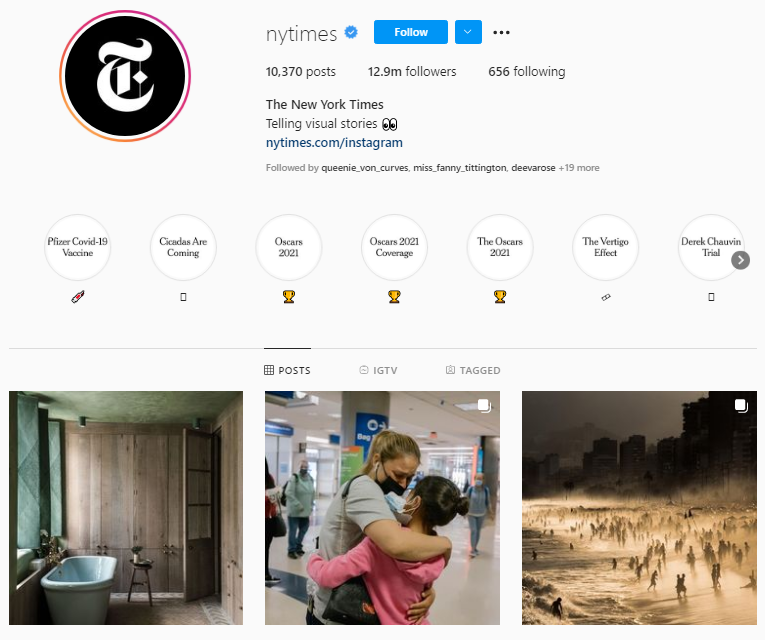
If you’re looking for an example of how to effectively use text for your Instagram highlight covers, check out the New York Times account. Each tile reflects the media outlet’s black and white branding and the text is simple and easy to read. For example, you can clearly see that their current story highlights cover the 2021 Oscars and the Pfizer COVID-19 vaccine.
Audit your Instagram highlight covers: If you’re currently using text for covers, be honest with yourself about how easy the content is to read. If followers don’t know what it says, they won’t click and your highlight is useless. How can you be more succinct while still being clear?
Keep Them On-Brand
I’ve already mentioned branding quite a bit because the overall look and feel of your feed is important. This is why you need to design your icons with your branding in mind, including your tone, colors, and word choices. Every highlight that you create needs to tie back to your original purpose and the message you’re trying to convey.
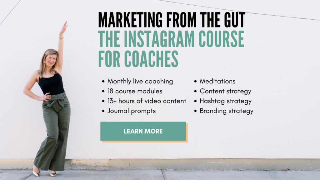
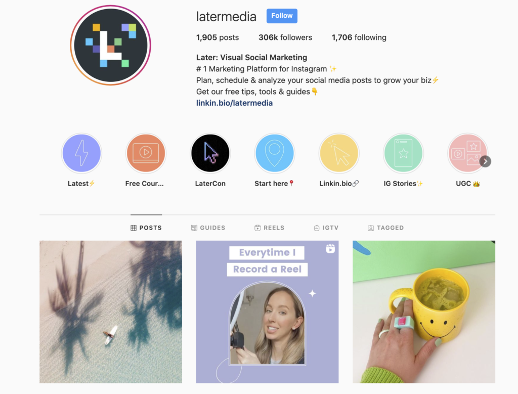
Later does a great job of branding their covers. If you scroll through their feed, you’ll see the same style and colors reflected in all of their posts seamlessly. The icons used are also simple and consistent, like the rest of their feed and overall brand, making the highlights a seamless part of the experience.
Audit your Instagram highlight covers: Go back to your brand guidelines and figure out how those translate into covers that best represent who you are. The goal: make sure followers know who’s profile they’re looking at when they’re on your feed.
Make Them Stand Out
Finally, make your highlight covers exciting. Even covers that are well-branded, simple, and valuable can stand out as being interesting or eye-catching.
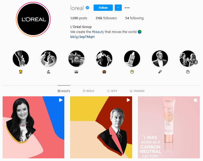
I love how L’Oreal doesn’t include any text within its icons and uses black and white imagery. While this doesn’t necessarily fit in with the overall colors of their feed design, it does match their profile photo, giving this area a clear and succinct feel that draws the eye.
Audit your Instagram highlight covers: How can you make your highlights stand out while keep it succinct and well-branded? This isn’t always an easy feat, but when done right, as with L’Oreal, your highlight covers can make a statement that few other accounts are.
Your Instagram Highlight Covers Matter
Continually test different icons and adjust the colors and styles to see what works best for your evolving brand and feed. As long as you develop your Instagram highlight covers mindfully and with a clear purpose, well-branded style, and simple wording and icons, you’re on the right path to making the most of this valuable real estate.